Saturday, April 28, 2007

High School Art Class


I never really liked to paint until 2000 when one of my gallery dealers suggested I add some color to my work. Up to that point I had been drawing, only working in pen & ink. When I started to paint, it was like working within the opposite end of my brain and a whole new world opened up to me - a world of color! There seemed to be so much more I could do than with just plain black and white. I bring this up because I have my very first painting sitting in my studio. I call it my first because it is actually the first painting I ever did in high school.


When I attended good old Trenton Central High, my art class, taught by Mr Tibbs was full of students with no real knowledge of art. I remember that there was one other guy in the class who had had some prior training in art classes, so while everyone else was learning about perspective, Mr Tibbs set the two of us to work on painting canvases. My model was named Sylvia and truthfully, she looked absolutely nothing like my portrait of her. I distinctly remember Mr Tibbs showing me how to use highlights in the background to bring out the figure in the foreground. Though I seemed to have some trouble with the placement of the model’s ear (lol), all in all it was a good start. It was also my first and only time using oils. Maybe I should think about trying them again. (Only problem with that is that oils take so long to dry and I’m known for doing paintings at the last minute - but you didn’t hear that from me…)

Thursday, April 26, 2007

My Day Job


How many people can say that they love what they do for a living? Well, I love what I do…most all the time. The great thing about my job is that I am an artist as my full-time job. I work for Wegmans Food Markets and I am the Sign shop artist for the store. I’m in charge of creating the overall look of the store with signs and setting them up to sell product. Its really a lot of fun as well as creative and challenging. I’ve posted a few of the projects I’ve worked on. Unfortunately they’re not the greatest photos.

Wednesday, April 25, 2007

The Klimt Connection

I wanted to touch on one of my other influences, Gustav Klimt. He had such a way with color and pattern, that I find his work absolutely fascinating! I looked at his technique and his use of pattern and color and I tried to imitate it in a few of my works. I experienced a breakthrough in the process. I discovered the layers of translucence that I can get with glazes. Glazing is painting an area with thinned out color over and over so that the end result is, well… translucent. Its hard to describe, but you know it when you see it.


My first 3 paintings using this technique were ones of my Trento series: The first was Trentette Barrettes, second was Trentiplenties and the third, which I think was the best, was Trentotex Fabrics. The glazing was used with all three, but the usage of pattern came more with the latter two. I just found so much enjoyment from the interplay of the shapes and colors.
This glazing technique as well as the use of shapes similar to Klimt’s (in spirit at least), carried over into later work - which leads me to one of my paintings that I’m most proud of ; The Smit Family portrait. Klimt used figures in a dream-like state in a good number of his paintings. This ethereal, airy feeling was one I thought I’d use to portray the family. There was a lot to incorporate into the picture: representations of 3 countries - USA, England and Holland as well as 5 people. Needless to say, using Big Ben, tulips, windmills, and the NYC skyline with a floating family was a tall task. Now, I’m no Klimt by any means, but as artists, what we are always doing is taking new ideas and elements wherever we find them and adding them to our own - making a whole new thing. That’s art!

Monday, April 23, 2007

Usable Art


Today I’m posting some of the more utilitarian items I’ve designed.
The first is my church’s 200th anniversary plate, next is a writing pen called Happy, which I designed for Acme Studio of Hawaii, and next is the business card case which complements the Happy pen.
They all kinda’ connect to my earlier post about the Bi-polar pendulum and how I like to make “happy” art as the bright colors and designs are meant to evoke feelings of ease and joyfulness.

Regarding the church plate, I wanted to do something different than most other anniversary plates that are made. Most show a photo or illustration of a church building. I the building is only a structure. The true church is the people - they are the life of what is called the church. I’m so glad that I have the opportunity to say that I am a part of this congregation - this family. In this, I visualized the actions that represent what my church does; prayer, communion, singing, working together, visiting the sick - these are the important things. I hope I did it justice.

The Happy pen and card case are sold in boutiques and stores all over the world.
As a side note , you may notice that in many of my art pieces you will see different ethnicities. I feel its important to show a wide range of people; large people, small people, different colors. Can you believe though that someone actually had the nerve to be offended that I didn’t put any “colored” faces on my happy pen? Hello… the white is a design element, not an indicator of ethnicity. Some people can be real idiots - and I say that respectfully. You can’t please everybody.

Friday, April 20, 2007

The Pie Sketch


Just thought I'd show you another project I'm in the middle of. Its a children's book illustration for a story I've written called The Pie in the Sky. Not the greatest photo, I know. I'll be painting it probably in acrylics - maybe watercolor.

I seem to be showing works that are in progress. I will finish them. It seems that I just have to be working on a variety of different projects at one time to keep things exciting.

Oh, its so 80's!


Look what I found! Its a poster design that I did back in college - my second year, 1985. It was my first poster and its complete with shoulder pads, thin tie and 80's hairstyle. I actually remember the assignment.
Its funny that all these years later I still seem to be doing the same thing - posters for fashion.
That year I fell in love with the work of the artist A.M.Cassandre. I've posted the actual one that I fell in love with. Its called Pathe. When I saw his work, I said to myself that I want to create posters just like that, so now all these years later, I've made it my art.

Thursday, April 19, 2007

Art Selling 101


“Don’t sell yourself short!” - A lesson to live by.


I won’t be selling my paintings on eBay to undercut myself or my current patrons/customers, so my prices there will be consistent with ones one would get if bought directly from me in person. I say this because I’ve got more fashion pieces up for grabs. I just put 2 more of them up on eBay and they're posted here. It kinda’ gets addictive. I’ve had no bids yet, but a lot of views. We’ll see what happens.


I’ve been watching eBay for awhile in the art section, and I find that unless one is a very well known artist, that the higher priced works don’t sell as auctions, but I put them up anyway. One never knows…

Wednesday, April 18, 2007

My eBay Auction


I’m selling on eBay! Well, I mean I hope it sells. I just posted one of my paintings. Its called Coeur: CafĂ© du soir (Heart: Coffee of the evening). And is part of a series. I designed 4 paintings of coffees for different times of the day, named after the four suits in a deck of cards. I’ve actually only painted 2 in the series, Heart and Diamond, but have painted Coeur in 2 different versions. I’ve posted photos of both versions of Coeur and the one of Carreau. Coeur is the only one for sale. The others have been purchased. Hope you like.

Tuesday, April 17, 2007

Virginia Tech

This horrendous tragedy is … I don’t even have the words.

My prayers and thoughts are with all of the victims, families and friends of those who were injured or killed in the Virginia Tech massacre.

I don’t understand… I just don’t understand.

Monday, April 16, 2007

The Bi-polar Pendulum


It seems a bit peculiar putting my thoughts and stuff out on the web for all to see, but maybe its therapeutic in some way. I weighed the ramifications of putting this out on my blog, but decided that its so integral to who I am, that I must include it in talking about my art. I was diagnosed with bi-polar illness in 2004. It is something that has definitely affected my artwork and what I portray.


With Bi-polar illness (also called manic-depressive illness) one’s mood fluctuates between depression and mania. I must say that the manic times are wonderful in that I have boundless energy, ideas come to me in droves, I can stay up all night painting without being tired - things like that. With the ups however, come the downs and the downs are usually more down than the ups are up. Those times of depression are very dark. I describe it as someone pulling a shade down and it becoming very clouded. These times are not what I want the world to see of me, because that is not how my personality comes across normally. As a result, I consider it very important to show joy and happiness in my work - hence the usage of bright colors and smiles in many of my pieces.


My sister suggested to me that I explore the dark sides of the illness in my art as well, as many other artists have. (She supposed that some of those artists most interesting work came at those times of hardship and trials). While I agree that this may be the case with many artists, I have an automatic aversion to it. I don’t do this for two reasons: 1. Because I have a very deep rooted belief that I was given this talent to uplift others and portraying darkness and gloom in my work is not what I’d call uplifting and 2. because I find it very difficult to paint when I am going through times of depression. I have no inspiration to create; no muses, no beacons of light. (What I find interesting is that I have no trouble writing at those times).


This illness has taught me so much about myself and helped me to accept things about myself. Maybe my sister is right about showing my sad side too, but right now its not a place I want to go. I don’t know. Life is about learning and I’m still learning. In the meantime, I’ve posted a couple of ‘happy’ pics.

Friday, April 13, 2007

Any Suggestions?


If you look at my work, one obvious thing about it is that I have two very distinct styles. This has been something that has been commented upon by a few people in the industry. One says I should find a way to combine the two styles into one. The other person says that I’m just on the verge of having a very powerful and memorable style, but that I have to push it just a bit further. I too believe that I am on the edge of a breakthrough, but my dilemma is exactly how to do it. My pen & ink work is very detailed and meticulous as well as in black & white. My acrylic paintings are loose and brightly colored.
Does anyone have any suggestions on what I can do to meld the styles together?
I suppose that the proving ground for this new style will be in the children’s book illustrations I’m starting. I’ll find my own way eventually, but its great to have input.

Thursday, April 12, 2007

The Kellingtons


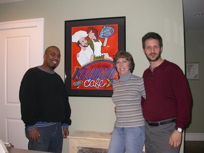
I do a fair amount of commissions. Many of which are portraits. I learn a bit about the person to be painted from the client, then incorporate their likeness and any other related items into the art. I take the person and turn them into a poster.


This is a painting I did for the Kellingtons. They had just remodeled their kitchen and wanted a focal point, so I did a portrait of them, incorporating their love of music and cooking. They were very pleased with the outcome.

Love Your PMS


Presenting the PMS bag! This little item shows my sometimes twisted sense of humor. PMS is an image I came up with awhile back. I thought it was great, (if I do say so myself) so I did a few variations. I was lucky enough to meet the owners of Joy and Jake - a home furnishings company, on whose bags I used to paint the images. They were very successful for me in sales. The first one, in blue was seen by a woman in my studio and she immediately said “I have to have it!” Well, I LOVE to hear that! Will that be cash or charge? lol.

Tuesday, April 03, 2007

Story Books


I create in a few different areas. One of these areas is in writing children’s stories. Just recently, I decided to put these stories down and work toward getting them published. To that end, I joined the Society of Children’s Book Writer’s and Illustrators at the recommendation of an old schoolmate, Robert Sabuda. He said I would learn a lot from them. Last night, I went to my chapter’s critique group and got to meet people, hear other people’s writing and read some of my own work to the group. I must say, it was a very good evening and I’ll definitely keep going.

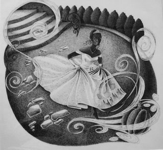
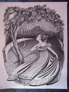
Cinderella was always my favorite fairy tale, so I’ve posted two Cinderella illustrations. One is from Grimm’s version, the other is a depiction of the live-action Disney movie with the singer Brandy as the star.

As you can see from this and the previous posts, I have two very distinct styles to my work. What I am trying to do is find a happy medium that infuses the best of both styles. Hopefully you’ll see the changes as I go along in this blog.

Sunday, April 01, 2007

TrentoVino

One of my longest running series of works is my Trento series. They're a group of paintings whose name comes from my hometown, but its a name that I turned into a story. The idea is that there is a company named Trento (The Trento Manufacturing Company) which makes anything and everything one could possibly imagine. This gave me oodles of ideas for products and allowed me to play with words like Trentine Gum (for Dentyne Gum) and TrentoBahn Tires (for the Autobahn). Get it? I had alot of fun with it and I aquired many customers and repeat customers through this series. I attempted to adapt the same idea to Bucks County Pennsylvania when I had a showing there, but it didn't seem to work as well. I'll have to see if it'll work in New York City.

Shown is one of my earlier Trento pieces, TrentoVino. Its one of my favorites. It one was sold to a disreputable poster dealer in New York. But I won't get into that here. :-(

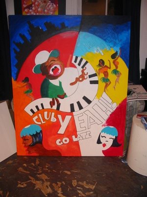
Club Yeah!


This is one of the latest of my works in progress. Its called CafĂ© Yeah! It depicts a Harlem night club in 1932 complete with dancing girls. Here’s the first sketch I did of it as well as the actual painting in its early stages. It is 5’ X 6’ and one of the larger canvases I’ve worked on.

I always do a lot of doodles and sketches before a painting (probably too many). I then project the image using a simple projector and trace the enlarged sketch onto the canvas and paint from there. I find that I get really good quick gestures and feeling in my sketches that I don’t seem to get if I go straight to full-size. Its also just a lot easier and quicker.

I really feel good about this painting and I believe it will be one of my best ever.